4 min read
Find out why customizations such as widgets and gadgets sound nice but is a main reason why most intranets fail.
By Jostle
Most intranet platforms are toolkits. You get a box of different components—widgets and pages—and you can build anything you want. To most people, this high level of customization sounds appealing. Unfortunately, it lies at the root of one of the most common reasons intranets fail. (Really fail.) Here’s why.
Building an intranet from widgets and gadgets is deceptively hard. It takes time, money, expertise, and perseverance. There are expert consultants whose full-time jobs are to build and maintain intranets. Paying one these people to maintain your intranet is vital if you choose to build a widget based intranet, but it’s very expensive.
The alternative is to try to maintain it in-house, without hiring a consultant or full-time IT person to maintain the architecture. If you decide to do this, the odds of your intranet succeeding are extremely slim.
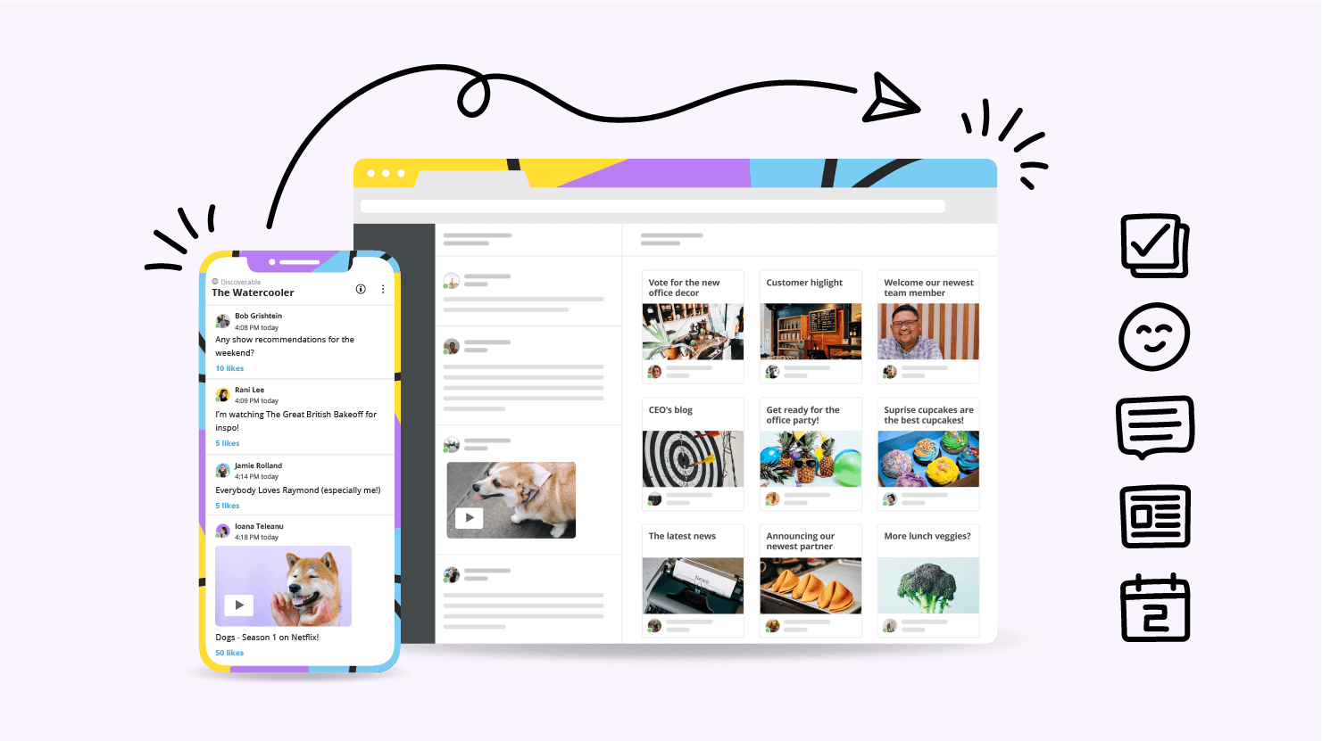
Most intranet platforms let you can add new pages whenever you want to. You may think this will make everyone happy, because everyone will have their own page: HR have their page, Sales have their page, even the projects have their own pages.
The problem with this is that you end up with too many pages and information silos. Information is isolated in these pages and people need to proactively visit these pages to find out if there’s been an update.
People don’t do this. They’re too busy doing their job to go out of their way to randomly check on, for example, the HR page to see if there’s been an update that’s relevant to them. Changes get made and people are none-the-wiser. The information simply gets lost or goes unnoticed.
This often occurs in response to Problem 1. A team creates a new page or updates a current page and they want to let people know. They soon realize the only way to reach people is to get their page featured on the homepage, because this is where everyone lands when they first come to the intranet.
They approach their IT guy – who has been given the responsibility of gatekeeping the intranet—and ask him to include a link to their page on the homepage. They ask for the link to their page to also include an image, so people really notice it.
The poor IT guy is not equipped to deal with such requests. He did not design the intranet’s layout, he does not understand usability, and he’s busy doing things he thinks are more business critical. He agrees to your request, and tacks on another widget to spotlight the page that he’s been asked to include. In doing this, he has unknowingly taken the first step to breaking the user experience of the homepage (and intranet).
Over time, as he responds to more requests of people lobbying to get their page featured or their link included, the intranet continues to break down. In the end, there are hundreds of links on the homepage, with no organized hierarchy or structure. He’s tacked new widgets onto old templates, further breaking the user experience. It’s disorganized and unclear – people don’t know where to go for information and what they can see is often irrelevant to them.
When people do navigate their way to a page, it’s not going to look like any of the others. Widgets give the creator of a page the ability to custom-design it, so they have the freedom to prioritize whatever they want on that page. This results in hundreds of pages that look nothing alike, which in turn results in an awful user experience.
Not only is every page going to be different—which means the user has to learn how to navigate every page—but very few people are savvy information architects. That’s simply not their expertise. Thus, the page they make may be inherently tricky to use.
Overall this results in a frustrating employee experience. Your intranet will quickly become a proliferation of pages that are impossible to navigate and tricky to update. This means people can’t find what they need, their irritation mounts, and abandonment occurs. Your intranet is dead.
At Jostle, we build an optimized information architecture into the platform and lock it down. It’s very simple to navigate and delivers a consistent, purposeful user experience. That’s why we’ve got employee participation rates of over 85% (as measured across all our customers).
You don’t have to worry about your intranet getting messy or people failing to find information. The Jostle® platform is extremely intuitive and relevant to the user. Without widgets, we’re able to deliver a fine-tuned intranet that’s structured to support the communication of work-relevant information for businesses of all shapes and sizes.
“We put a lot of support materials in the Jostle platform. So, people knew where they could go to find it. Putting essential work-relevant information in the Jostle intranet means that staff get used to going in there and the platform becomes a reliable way to get important updates to them.”
Frank Rizzo
Director of Instructional & Information Technology, Alden School District


Read more by
Jostle

Jostle’s employee success platform is where everyone connects, communicates, and celebrates at work. Find out more at jostle.me. © 2009–2024 Jostle Corporation. All rights reserved.